Stakeholder interviews
We interviewed senders, receivers, and platform administrators to clarify roles and uncover challenges across the communication flow. The synthesis surfaced issues around message trust, permissions by role, and efficiency.
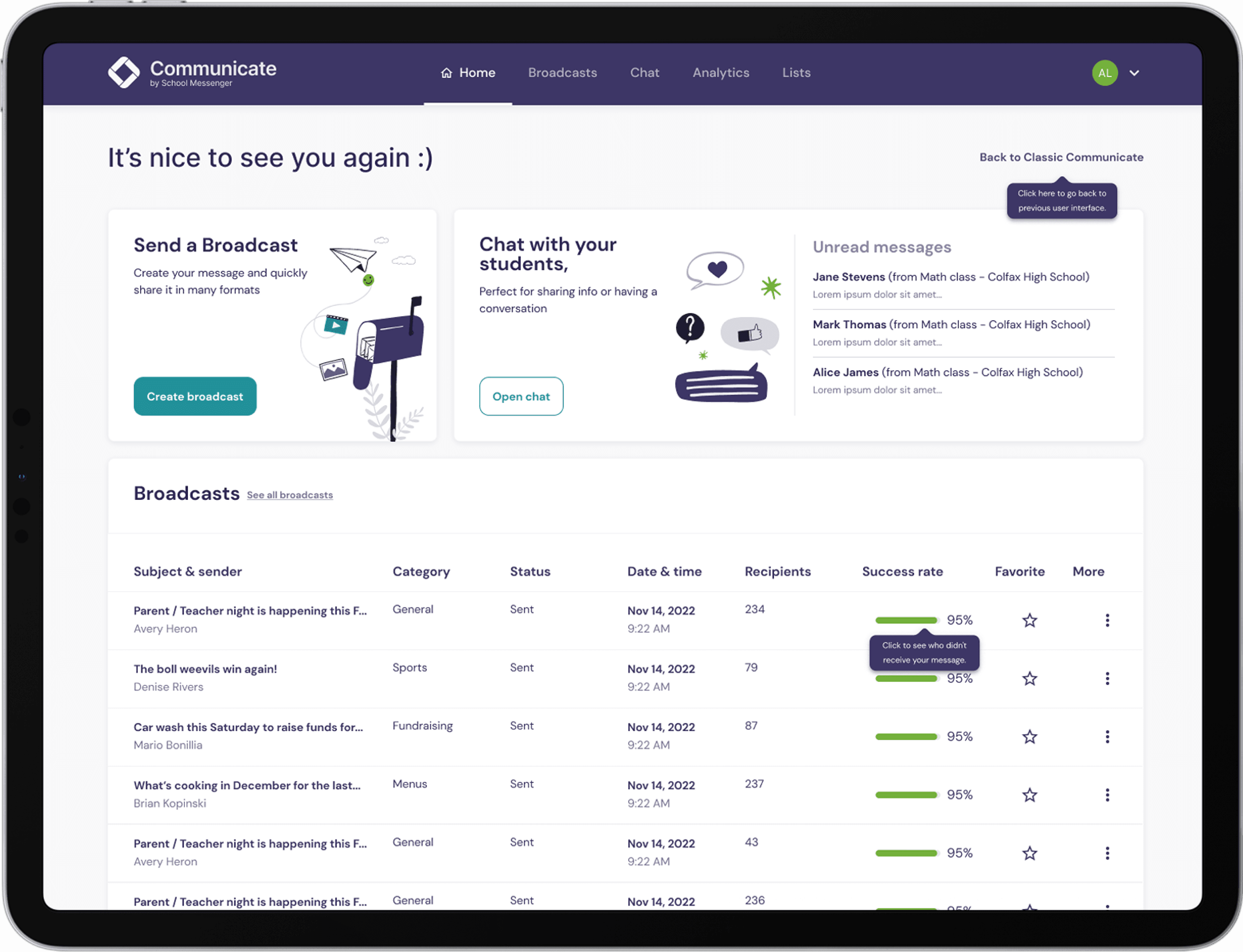
SchoolMessenger needed to modernize an experience used by parents, teachers, administrators, and school districts across the U.S. and Canada. The work focused on three core needs: flexibility, trust, and efficiency.
My role
As Associate Design Director, I led a multidisciplinary team, defined the design strategy, facilitated stakeholder and collaborative workshops, and directed the work from research through prototypes, testing, and UI kit delivery.
The challenge
Years of accumulated complexity had created inefficient navigation, limited feedback, inconsistent interaction patterns, and friction across different user roles. We needed to improve the broadcast experience while creating a foundation the product team could continue to scale.
How we moved the work forward
Key activitiesThe work combined strategic alignment, practical design work, and validation. Each activity reduced a different kind of uncertainty and helped the team make the next decision with greater confidence.
We interviewed senders, receivers, and platform administrators to clarify roles and uncover challenges across the communication flow. The synthesis surfaced issues around message trust, permissions by role, and efficiency.
We assessed the existing platform against usability principles, identifying navigation inefficiencies, missing feedback, and inconsistent interactions. Prioritized recommendations focused the redesign on the problems with the greatest impact.
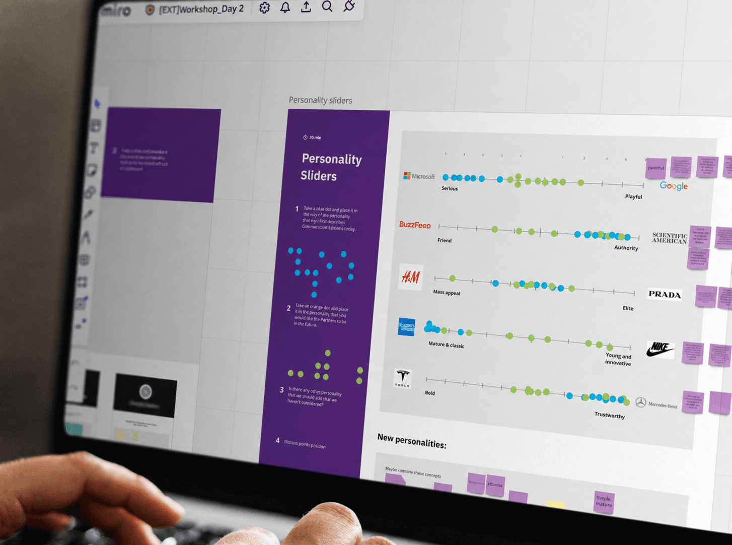
Platform analysis, competitive benchmarking, and user research were consolidated into a strategic readout. It aligned stakeholders around context, pain points, and opportunity areas.
A map of the complete experience made frustrations across the communication journey visible. It connected individual issues to the broader themes of flexibility, trust, and efficiency.
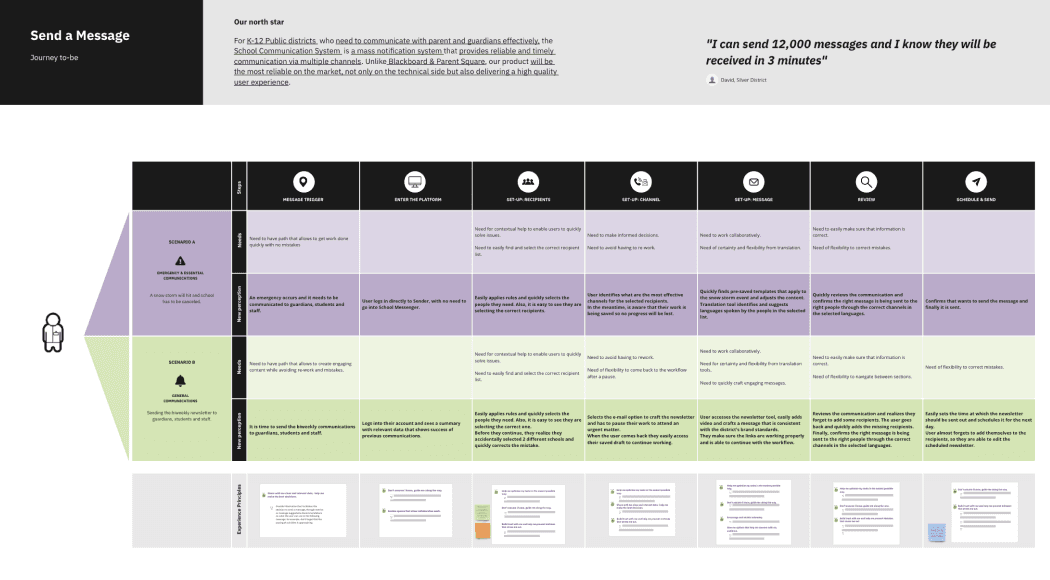
We designed a future journey for sending a message. The new flow reduced cognitive load, reflected real communication behavior, and gave the team a shared blueprint for prototyping.
Two navigation approaches, Free Creator and One Pager, were tested through unmoderated sessions. Task performance and preference validated One Pager as the more intuitive broadcast flow.
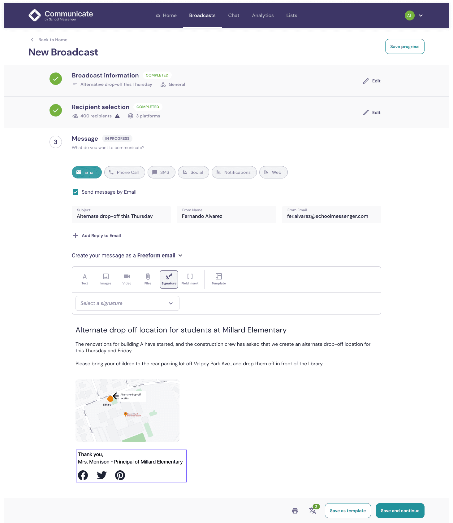
Early broadcast prototypes were tested for task order, navigation clarity, and efficiency. Findings led to changes such as reordering message creation steps and reducing errors.
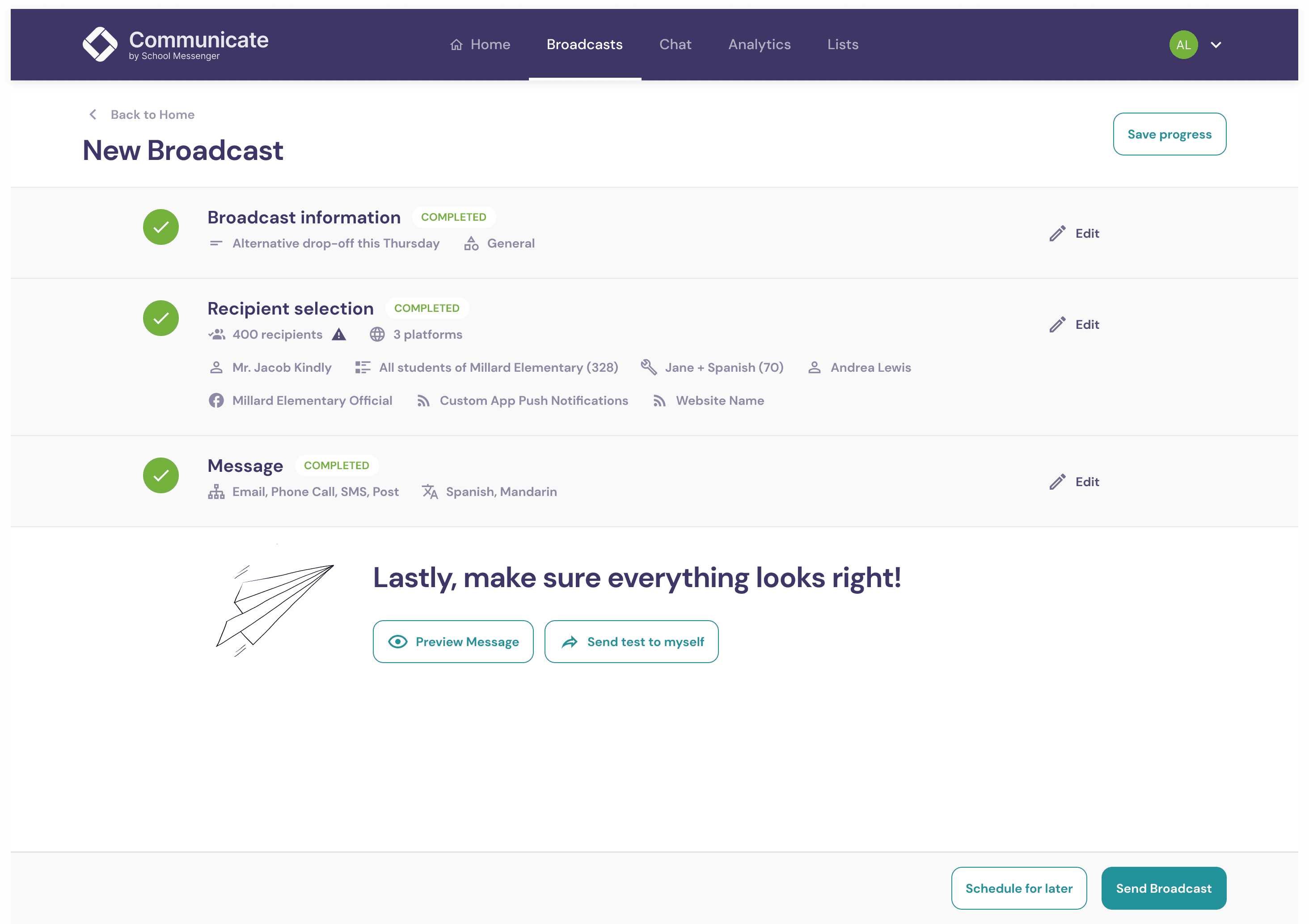
Interactive prototypes with detailed visuals brought the new experience to life for testing and iteration. The visual language established a modern, accessible, and consistent direction.
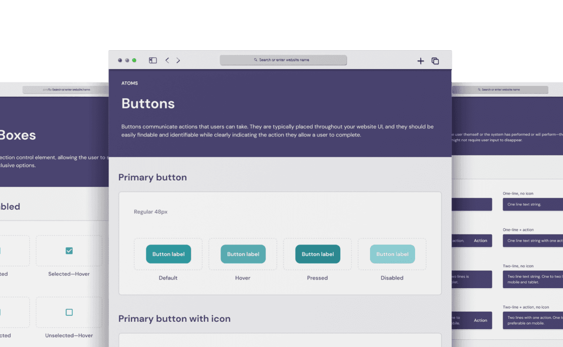
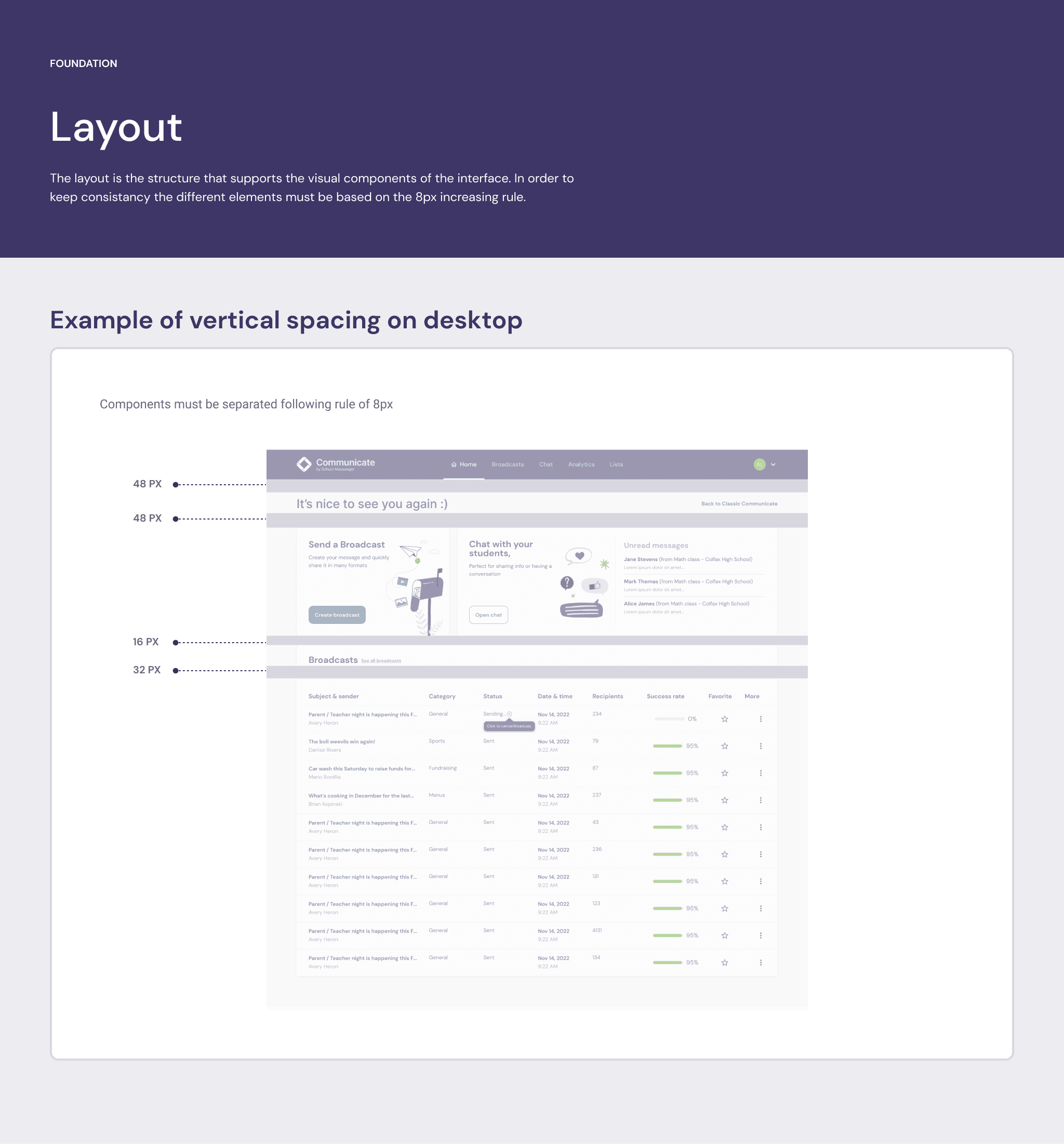
The final UI kit documented components, states, usage guidance, and accessibility expectations. It created a shared reference for design and engineering and a scalable foundation.
Outcome
“I love all the insights you were able to consolidate. Excellent work. This document will be helpful for the next few years.”A.L., Director of UX Research and Design